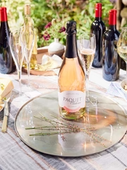
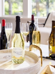
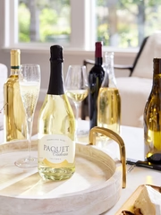
You will also notice different colors of glass. The first three wines above are in colored glass and the last two are in clear glass. Many wines are bottled in an amber glass called Antique Green as it helps protect the wine from too much light during aging, while others are bottled in clear glass which we call Flint to display the wine’s light or dark color.
In terms of finishes, we bottle our wines with three different types of finishes―screw cap (Suburban Fracas Skirmish―no wine opener required!), cork (Halcyon Chardonnay, Milano Cellars Merlot and Terroir Cellars Grenache) and crown finish (Sauve Pop).
The bottom of the wine bottle, known as the punt or heel was originally designed for stability to avoid sliding. To my knowledge, every manufacturer has its own design, and I am not aware that there is a particular significance between all of them. However, the markings around and underneath the bottle are very useful. They indicate the volume, the manufacturer, the date of conception and the oven cavity number the bottle was baked into. This last part is very useful for quality control issues with a truckload of cases.
 We use approximately 15 to 20 different types of bottles per year. Packaging cost, marketing and overall final look are the main reasons we pick specific bottles.
The Labels
For this segment about labels, I could bore you with the type of paper used, their thickness and the color code used for our Joy label. Instead, I would like to focus on a different aspect of what WineShop At Home can offer. All success stories have dedicated people behind them.
Sam, Lauren, our graphic designer Wendy and I meet regularly to brainstorm new ideas, directions and thoughts that emerge into brands, well, at least some of them do. We evaluate our portfolio looking for opportunities, new colors or styles that we haven’t yet represented. Once we hone in on an idea, Wendy gets to work on options―lots of options―for us. We iterate, tweak, review and revise until we are satisfied and then we select the right bottles and closures to match.
“One of my favorite stories is when we were working on the Family Ranch label, but we kept it a secret from Stan until we were ready for the grand reveal. Luckily, I had a guy on the inside to take photos of the picturesque front porch and rocker for the label. When we finally revealed the brand to Stan, he was overjoyed.” – Wendy White, Trybe Creative.
“My favorite label so far has to be Suburban Fracas. When we reviewed our brands, I thought that we were missing something edgy, so we came up with the idea of hiring a tattoo artist to design a custom piece just for us. It was a true collaboration and I’m so happy with the bright and colorful results.” – Sam Lloyd.
But the ultimate reward is a comment at Convention or on Facebook saying, “Isn't this label GORGEOUS?!”. That’s what it’s all about!
We use approximately 15 to 20 different types of bottles per year. Packaging cost, marketing and overall final look are the main reasons we pick specific bottles.
The Labels
For this segment about labels, I could bore you with the type of paper used, their thickness and the color code used for our Joy label. Instead, I would like to focus on a different aspect of what WineShop At Home can offer. All success stories have dedicated people behind them.
Sam, Lauren, our graphic designer Wendy and I meet regularly to brainstorm new ideas, directions and thoughts that emerge into brands, well, at least some of them do. We evaluate our portfolio looking for opportunities, new colors or styles that we haven’t yet represented. Once we hone in on an idea, Wendy gets to work on options―lots of options―for us. We iterate, tweak, review and revise until we are satisfied and then we select the right bottles and closures to match.
“One of my favorite stories is when we were working on the Family Ranch label, but we kept it a secret from Stan until we were ready for the grand reveal. Luckily, I had a guy on the inside to take photos of the picturesque front porch and rocker for the label. When we finally revealed the brand to Stan, he was overjoyed.” – Wendy White, Trybe Creative.
“My favorite label so far has to be Suburban Fracas. When we reviewed our brands, I thought that we were missing something edgy, so we came up with the idea of hiring a tattoo artist to design a custom piece just for us. It was a true collaboration and I’m so happy with the bright and colorful results.” – Sam Lloyd.
But the ultimate reward is a comment at Convention or on Facebook saying, “Isn't this label GORGEOUS?!”. That’s what it’s all about!